Regression is a statistical method used to study the relationship between variables. It helps us understand how one or more independent variables (predictors) influence a dependent variable (response).
At its core, regression answers this question:
“How does a change in one variable affect another?”
🔍 Why Study Regression?
Regression is a powerful tool used to:
Predict future outcomes
Identify trends and relationships
Test hypotheses
Inform decisions and policies
🎓 Real-World Questions Answered by Regression
Context
Question
Genetics
Are daughters taller than their mothers?
Education
Does reducing class size improve student performance?
Geology
Can we predict the time of Old Faithful’s next eruption using the last one?
Health & Nutrition
Do dietary changes reduce cholesterol levels?
Economics & Demographics
Do wealthier countries have lower birth rates?
Transportation
Can better highway designs lower accident rates?
Environmental Science
Is water usage increasing over the years?
Real Estate & Conservation
Do conservation easements reduce land values?
🧮 Linear Regression: The Foundation
Here we will focus on Linear Regression, the most commonly used regression technique.
What is Linear Regression?
Linear regression models the relationship between variables by fitting a straight line to the data. It assumes the response is a linear function of the predictors.
It is easy to interpret.
It forms the basis for more advanced regression techniques.
It is widely applicable in fields like economics, biology, engineering, and social sciences.
🎯 Objective of Regression Analysis
The main goal of regression is to:
Summarize complex data in a simple and meaningful way
Understand relationships between variables
Make predictions and inform decisions
Represent relationships elegantly and effectively
Sometimes, a theory or prior knowledge may guide the form of the relationship (e.g., linear, quadratic).
✍️ Key Takeaways
Regression studies dependence between variables.
It helps answer a wide range of real-world questions.
Linear regression is the cornerstone of most regression techniques.
Simplicity, interpretability, and utility are at the heart of regression analysis.
Thank you! Here’s the previously structured version with all heading numbers removed, making it visually clean and ideal for student-friendly materials like slides, handouts, or websites.
📌 Scatterplots – A First Look at Regression
📘 Understanding the Basics
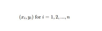
In simple regression, we study how one variable (X)—called the predictor influences another variable (Y), the response. We observe data in pairs:
X: Independent variable (e.g., mother’s height)
Y: Dependent variable (e.g., daughter’s height)
To explore the relationship visually, we use a scatterplot.
📊 What is a Scatterplot?
A scatterplot is a graph that shows each observation as a point:
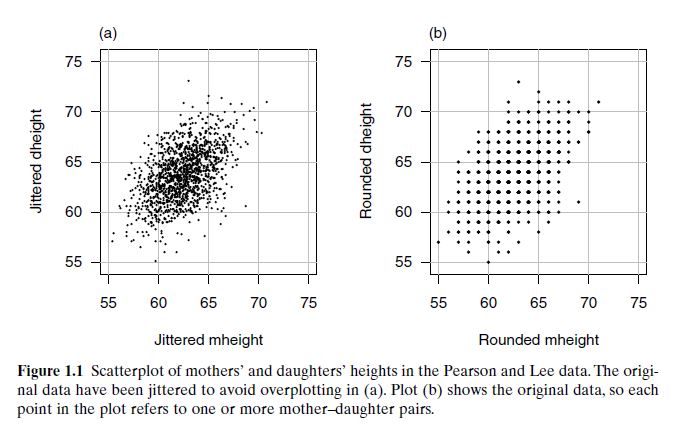
Karl Pearson (1893–1898) collected data on 1375 mother–daughter pairs in the UK. He wanted to understand: 👉 “Do taller mothers tend to have taller daughters?”
Predictor
Response
Mother’s Height (mheight)
Daughter’s Height (dheight)
We visualize the data using a scatterplot:
🔎 Figure: Jittered Scatterplot
Adds slight randomness to avoid overplotting (many points at same location).
Gives clearer view of point density.
🔎 Figure: Original Data
Shows exact height values (rounded to nearest inch).
Suffers from overplotting—multiple data points overlap.
✨ Key Insights from the Scatterplot
Equal Axes for Fair Comparison
Since mothers and daughters have similar height ranges, both axes should be scaled equally.
A perfect 45° line would represent identical heights.
Jittering Removes Overlap
Helps in showing all data points.
A small random value (±0.5) is added to each value to unstack the points.
Detecting Dependence
Scatter of points changes with the predictor.
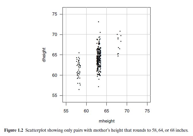
See visual comparison using mheight = 58, 64, 68: ➤ Average daughter’s height increases with mother’s height.
Elliptical Shape Suggests Linearity
Points form an ellipse tilted upward.
Implies a positive linear trend.
A good candidate for simple linear regression.
Special Data Points
Type
Description
Role
Leverage Points
Unusually high or low X-values
Strong influence on regression line
Outliers
Unusually high or low Y-values for given X
May indicate anomalies or errors
A scatterplot helps check if the response depends on the predictor—here, taller mothers generally have taller daughters, showing an upward trend. Figure 1.2 shows that as mother’s height increases (58, 64, 68 inches), the average daughter’s height also increases. Points far from others horizontally are leverage points; vertically distant ones are potential outliers.
🧠 Summary: Why Scatterplots Matter
Offer visual insight before any formal modeling.
Help assess:
Strength and direction of relationship
Suitability for regression (e.g., linearity)
Presence of outliers or influential points
✅ Pro Tips
Always plot your data first—regression comes later!
Use jittering when data is rounded.
Maintain equal axis scaling when variables are measured on similar scales.
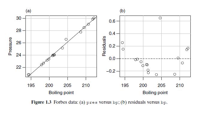
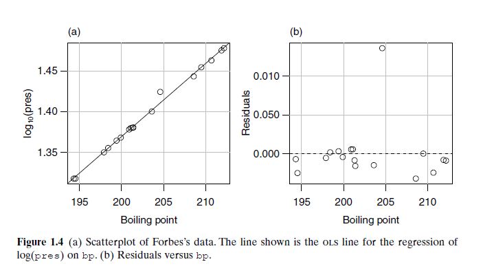
Forbes’s Data (Figures 1.3 & 1.4): Collected in the 19th century (1800s) by James D. Forbes, the data show the relationship between boiling point and atmospheric pressure. Figure 1.3a reveals a curved trend, and residuals in 1.3b show a poor linear fit. After applying a log transformation to pressure, Figure 1.4a becomes linear, and residuals in 1.4b scatter evenly—indicating a good linear model.
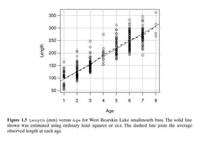
Smallmouth Bass Growth (Figure 1.5): Collected from Lake Ontario in the 1970s, this data shows how length increases with age. However, there’s large variability among fish of the same age, meaning regression estimates the average size, not individual growth. Predictions carry uncertainty due to biological variation.
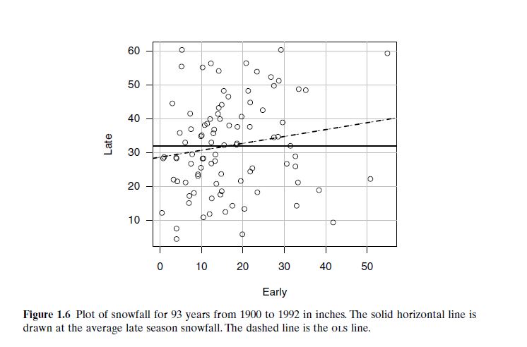
Snowfall Prediction (Figure 1.6): From Flagstaff, Arizona, data from 1910 to 1960 compares early and late seasonal snowfall. The scatterplot shows no meaningful trend—early snowfall (Sept–Dec) does not predict later snowfall (Jan–May). Correlation is weak or absent.
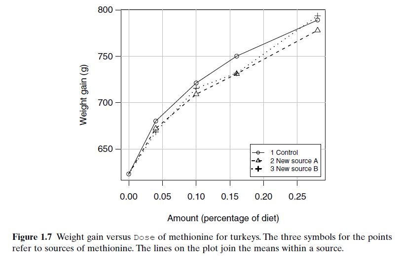
Turkey Weight Gain (Figure 1.7): From an animal nutrition study in the 1960s, the data explore how turkey weight gain varies with methionine dose and its source. Gain increases with dose, but overlapping variability and different slopes among sources suggest potential interactions and biological complexity.
MEAN FUNCTION
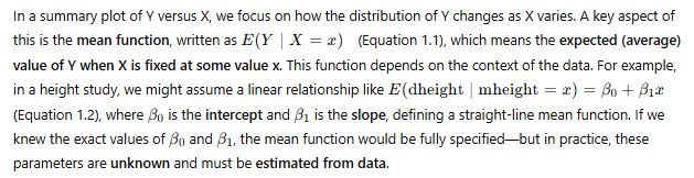
The mean function describes how the average value of a response variable (Y) changes with a predictor variable (X). It is written as E(Y | X = x), meaning the expected value of Y given that X takes a specific value x. In many cases, we model this relationship using a straight line, such as E(Y | X = x) = β₀ + β₁x, where β₀ is the intercept and β₁ is the slope. This linear form represents a simple mean function and helps us understand the trend between variables.
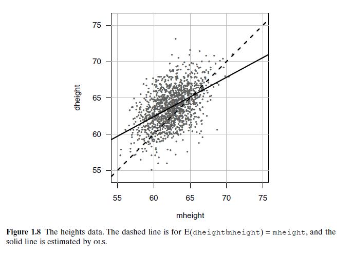
In the Galton height dataset (collected in 1885–1886), we examine how a daughter’s height (dheight) depends on her mother’s height (mheight). If mothers and daughters were exactly the same height, we’d expect a mean function with slope 1. This is shown as a dashed line in Figure 1.8. However, the observed data shows a solid line with slope less than 1, indicating that tall mothers tend to have slightly shorter daughters, and short mothers slightly taller daughters. This effect is known as regression to the mean, a phenomenon first noted by Francis Galton.
In another example, Figure 1.5 uses smallmouth bass data to illustrate the concept. The dashed curve connects the average length of fish at each age, forming an empirical estimate of E(length | age). This curve acts as the mean function, summarizing how expected fish length increases with age. The individual data points still show variation around the curve, reminding us that not all fish grow at the same rate.
What does “mean” have to do with it?
The mean (average) serves as a reference point for understanding the relationship between mothers’ and daughters’ heights. In the context of Galton’s data:
If height were perfectly inherited, we’d expect that a mother one inch taller than average would have a daughter also one inch taller than average.
This would result in a mean function (i.e., the expected daughter height given mother’s height) with a slope of 1 — meaning daughters’ heights track perfectly with mothers’.
But what was observed?
The regression line (the solid line) had a slope less than 1 — meaning:
Tall mothers tend to have daughters who are tall but not quite as tall.
Short mothers tend to have daughters who are short but not quite as short.
Over many cases, extreme values (very tall or very short) regress toward the mean height.
📉 Why is the mean function important here?
It defines expectations:
The mean function tells us the expected daughter’s height for a given mother’s height.
Without the concept of the mean, we can’t define or detect regression to the mean.
It reveals the pattern:
The deviation from the dashed line (slope = 1) shows that heredity is not perfect.
This pattern emerges statistically when analyzing many mother–daughter pairs and comparing them to the mean of the population.
🧠 What does “regression to the mean” actually mean?
It means that:
Children of extreme parents (very tall or very short) tend to be closer to the average height than their parents.
It’s not because of any active “pull” toward the mean — it’s a statistical effect that arises because traits like height are influenced by both genetics and environment, and some of the extremes are due to random variation.
Thus, the mean function is central to regression—it captures how the average response changes with the predictor and provides the basis for building statistical models.
📊 Understanding Variance Functions in Regression
When analyzing how a response variable (like a daughter’s height) depends on a predictor (like a mother’s height), we don’t just look at the average trend—we also care about how spread out the data is. This is where the variance function comes in.
🔍 What Is a Variance Function?
The variance function tells us how variable the response is when we fix the predictor at a certain value. Mathematically, it is written as:
Var(Y | X = x) (read as: the variance of Y given X equals x)
This function gives insight into how consistent or spread out the response values are around their mean, for each fixed value of the predictor.
📈 Visual Examples
Figure 1.2 – Daughters’ Height vs. Mothers’ Height
For the Galton height data:
The variability in daughter’s height for given mother’s heights (58, 64, 68 inches) appears roughly constant.
This means the spread of daughter heights doesn’t change much across different mother heights.
Figure 1.5 – Smallmouth Bass Length by Age
Here too, the variance in fish lengths across ages seems fairly consistent.
Although it’s not guaranteed, assuming constant variance is reasonable in this case.
Turkey Data Example
In the turkey weight dataset, only treatment means are plotted—not individual pen-level values.
So, we can’t evaluate the variance function directly, since the graph doesn’t show within-treatment variability.
📏 Common Assumption in Linear Models
In many simple linear regression models, we assume the variance stays the same for all values of x:
Var(Y | X = x) = σ² Where:
σ² (sigma squared) is a positive constant,
It reflects a uniform level of variability across all predictor values.
This assumption helps simplify model fitting, although more advanced models (explored in Chapter 7) can allow variance to change with x.
🧠 Key Takeaway
While the mean function tells us the average trend, the variance function reveals how spread out the data is at each level of the predictor. Both are essential for building and interpreting effective regression models.
📚 Disclaimer: The concepts, explanations, and figures presented on this webpage are adapted from the textbook Applied Linear Regression by Sanford Weisberg, 4th Edition, Wiley-Interscience (2013). All rights and credits belong to the original author and publisher
Simple Linear Regression
Linear Regression: Least Squares Estimation
Source: Draper & Smith, Applied Regression Analysis — Fitting a Straight Line by Least Squares — @ S. S. Roy
The Model
Y = β₀ + β₁X + ε
Every observation of the response Y is the straight-line part β₀ + β₁X plus a random error ε — the amount by which an individual Y falls off the line. β₀ (intercept) and β₁ (slope) are the unknown parameters; errors are assumed independent with mean zero.
For n observed pairs (X₁,Y₁), …, (Xₙ,Yₙ):
Yᵢ = β₀ + β₁Xᵢ + εᵢ, i = 1, …, n
“Linear” means linear in the parameters, not in X: Y = β₀ + β₁X + β₁₁X² + ε is still a linear model (second-order in X), because the β’s enter linearly.
The Least Squares Idea
We estimate β₀, β₁ by b₀, b₁, giving the fitted (prediction) equation:
Ŷ = b₀ + b₁X
(Ŷ = “Y-hat” = predicted value of Y for a given X.)
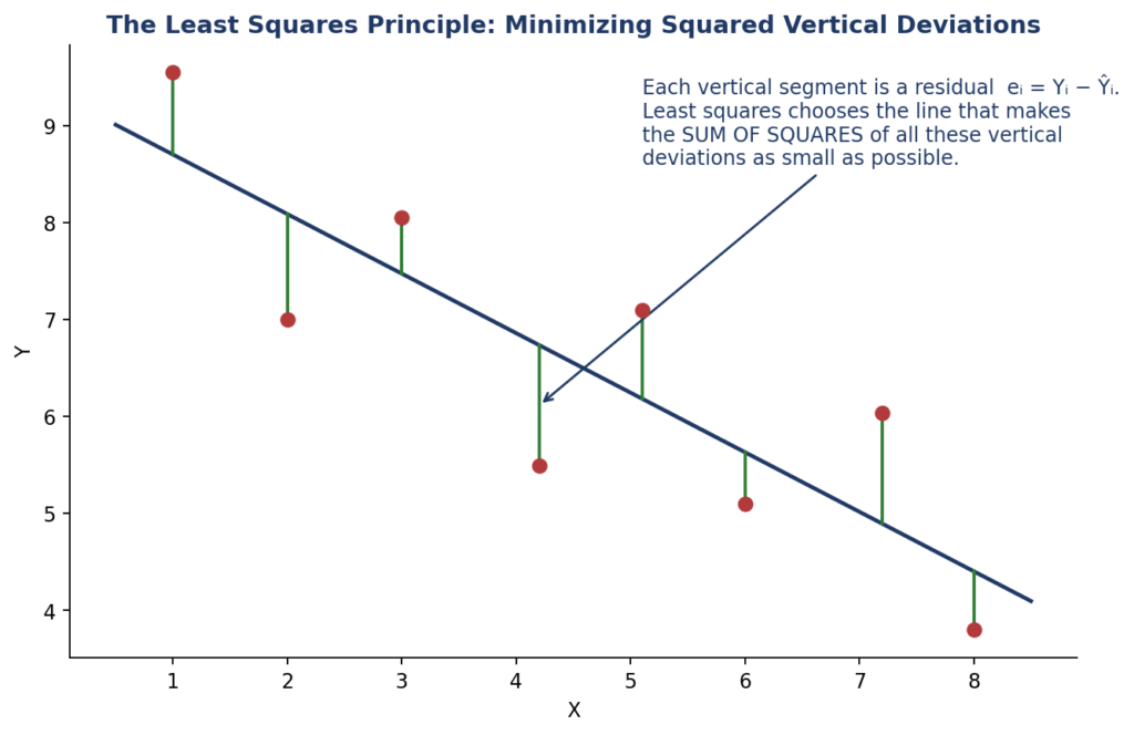
Choose b₀, b₁ to minimize the sum of squares function — the total squared vertical deviation of the points from the line:
S = Σεᵢ² = Σ(Yᵢ − β₀ − β₁Xᵢ)²
The least squares line is the one line making this sum of squared vertical discrepancies as small as possible.
Deriving the Estimates (Normal Equations)
Differentiate S with respect to each parameter and set to zero:
Substituting b₀ back gives the alternative fitted form:
Ŷ = Ȳ + b₁(X − X̄)
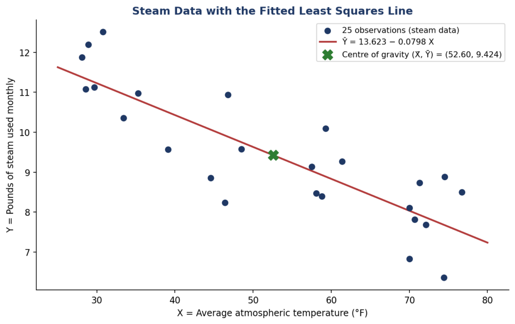
which shows immediately: at X = X̄, Ŷ = Ȳ — the least squares line always passes through the centre of gravity (X̄, Ȳ) of the data.
Key Property of Residuals
The residual for each point is eᵢ = Yᵢ − Ŷᵢ (our estimate of the error εᵢ). Whenever the model contains β₀:
Σ(Yᵢ − Ŷᵢ) = 0
— residuals always sum to zero (a direct consequence of the first normal equation). Omitting β₀ forces the line through the origin, a very strong assumption that is usually unjustified.
Worked Example: The Steam Data (n = 25)
Y = pounds of steam used monthly; X = average atmospheric temperature (°F). Computed sums:
Interpretation: each 1°F rise in average temperature reduces monthly steam use by about 0.08 units; b₀ = 13.62 is the predicted use at X = 0.
Caution on extrapolation: the fitted line is valid only over the observed range of X. Predictions outside the region covered by the data are dangerous — and in multiple dimensions a point can lie outside the data region even when each coordinate individually is within its observed range.
Summary
Model Y = β₀ + β₁X + ε → minimize S = Σ(Yᵢ − β₀ − β₁Xᵢ)² → normal equations → b₁ = Sxy/Sxx, b₀ = Ȳ − b₁X̄ → line passes through (X̄, Ȳ), residuals sum to zero. That is the complete least squares machinery for a straight line.
Interpretation: holding x₂ fixed, a one-unit increase in x₁ raises Y by about 3.48; holding x₁ fixed, a one-unit increase in x₂ lowers Y by about 0.05 — so x₂ contributes very little to this fit.
Reminder: Inverse of a 2×2 Matrix
For A = ⎡a b⎤ , det(A) = ad − bc. If det(A) = 0, A is not invertible. ⎣c d⎦
A⁻¹ = (1/(ad − bc)) ⎡ d −b⎤ ⎣−c a⎦
Example: A = ⎡4 3⎤ , det = (4)(1) − (3)(2) = −2 ≠ 0, so ⎣2 1⎦
A⁻¹ = (1/−2) ⎡1 −3⎤ = ⎡−½ 3/2⎤ ⎣−2 4⎦ ⎣ 1 −2 ⎦
Summary
Write the data as X (with a leading 1’s column) and Y → compute XᵀX → check det ≠ 0 → invert via adjoint/det → β̂ = (XᵀX)⁻¹XᵀY. The result is the vector of intercept and coefficients that minimizes the sum of squared errors, exactly as least squares does in the one-predictor case.
Since P(Yes | X) > P(No | X), the Naïve Bayes classifier predicts “Buys_computer = Yes”.
Summary Table
Step
Value “Yes”
Value “No”
Prior probability
9/14 = 0.643
5/14 = 0.357
Age = Youth
2/9 = 0.222
3/5 = 0.600
Income = Medium
4/9 = 0.444
2/5 = 0.400
Student = Yes
6/9 = 0.667
1/5 = 0.200
Credit_rating = Fair
6/9 = 0.667
2/5 = 0.400
Likelihood P(X|C)
0.044
0.019
Posterior (final score)
0.028
0.007
Prediction
Yes ✔
No
What If Any Probability Is Zero?
If an attribute value never appears for a class, its probability is 0 and it wipes out the entire product. Use Laplace correction:
P(xₖ | Cᵢ) = (count + 1) / (total for Cᵢ + number of attribute values)
PART B — Continuous Attributes (Gaussian Naïve Bayes)
Why the Gaussian Distribution?
When a feature (like Age or Income) is continuous, counting exact matches does not work — no two values repeat. Naïve Bayes instead assumes the values are normally distributed within each class, and computes the likelihood using the Gaussian Probability Density Function:
Since P(No | X) > P(Yes | X), the classifier predicts “No” — the person does not buy a computer.
Note how close the two scores are (ratio ≈ 1.3). Age = 38 sits between the two class means (30 and 45), so age alone is nearly uninformative here; the decision is driven almost entirely by Income = 50, which is far from the “No” mean of 71.67 but also far from the “Yes” mean of 42.33 relative to its small σ = 2.05.
Summary: Why the Gaussian Matters
For continuous features, exact probability counts do not work — values rarely repeat.
The Gaussian distribution lets Naïve Bayes estimate the likelihood from just the mean and variance of each class.
It is simple, fast, and surprisingly effective whenever the normality assumption roughly holds.
When attributes are continuous, we assume they follow a normal (Gaussian) distribution. This allows us to use the Gaussian Probability Density Function (PDF) to calculate probabilities.
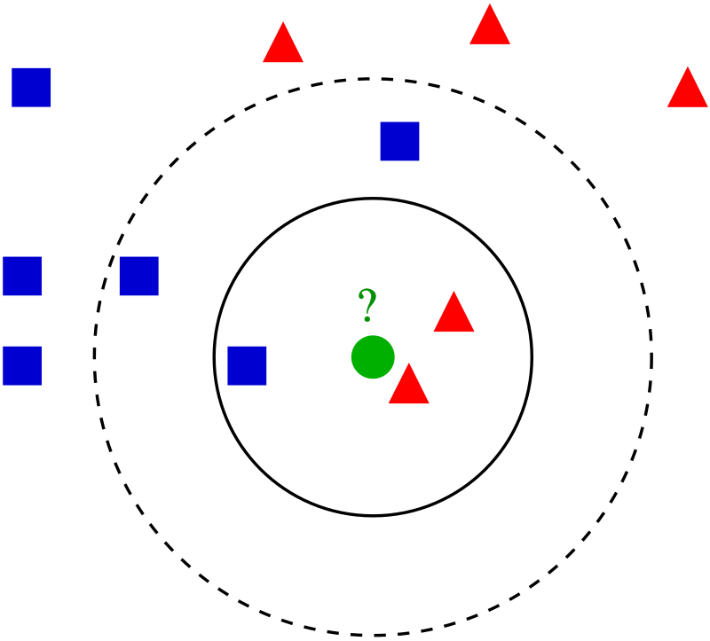
The k-nearest neighbors (k-NN) algorithm is a simple yet powerful supervised learning technique that does not make assumptions about the underlying data distribution, making it a non-parametric method. Introduced by Evelyn Fix and Joseph Hodges in 1951 and further developed by Thomas Cover, k-NN is widely applied in classification tasks, where an input is assigned the class most common among its k closest points in the training data. In the case of k=1, the label is directly taken from the nearest neighbor. Beyond classification, k-NN also supports regression tasks by averaging the target values of nearby data points, a method often referred to as nearest neighbor interpolation. To enhance prediction accuracy, particularly in scenarios with varying neighbor distances, weights can be applied — frequently in the form of an inverse relationship with distance (e.g., 1/d). Importantly, since the algorithm depends heavily on distance metrics, proper scaling or normalization of features is crucial, especially when the data includes heterogeneous units or differing value ranges.
Above figure shows, In k-NN, if k = 3 (2 triangles, 1 square), the test sample is classified as a triangle; if k = 5 (3 squares, 2 triangles), it’s classified as a square.
k-NN is a non-parametric supervised learning algorithm that operates without assuming a specific distribution for the data.
Originally developed in 1951, it assigns class labels based on the majority vote among the k nearest data points in classification tasks.
In regression settings, k-NN predicts a value by averaging the outputs of the k closest neighbors, with k=1 yielding a simple interpolation.
Weighted k-NN can improve performance by giving more influence to closer neighbors, often using weights inversely proportional to distance (like 1/d).
Normalization of features is essential, as the algorithm’s distance-based nature makes it sensitive to differences in scale or units across attributes.
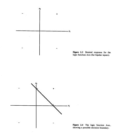
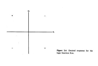
Simple McCulloch-Pitts neurons can be used to design logical operations
A McCulloch–Pitts neural network is a simple mathematical model of a neuron that takes binary inputs, applies weights, sums them, and produces a binary output based on a fixed threshold, used to represent basic logic functions.
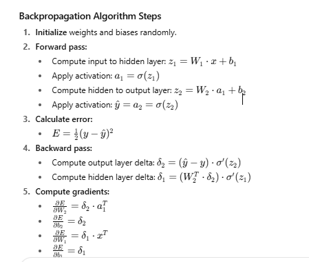
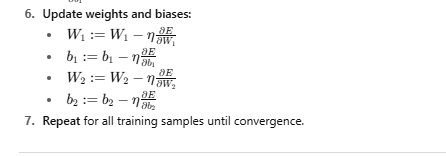
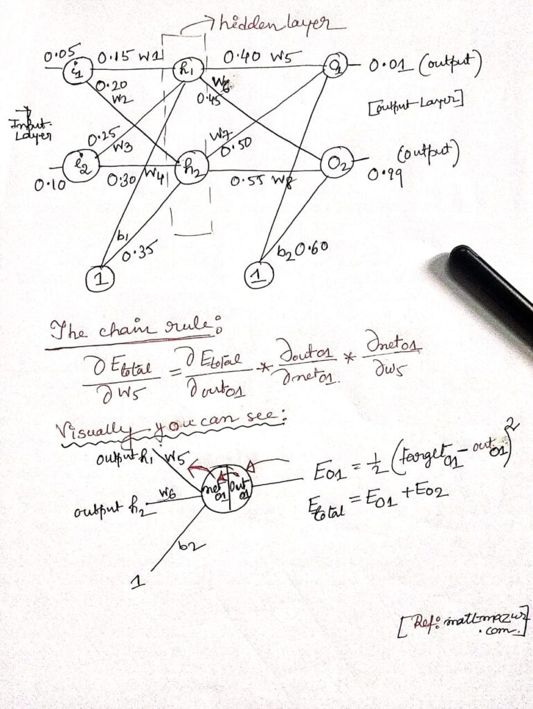
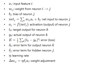
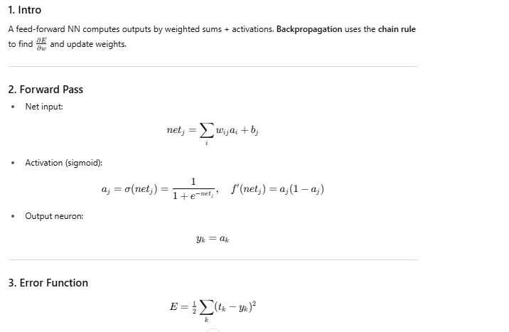
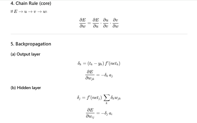
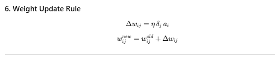
Backpropagation is a fundamental algorithm used to train artificial neural networks by minimizing the error between the network’s predicted output and the actual target output. It works by performing a forward pass to compute the outputs based on current weights and biases, then calculating the error using a loss function such as mean squared error. The algorithm then propagates this error backward through the network, layer by layer, using the chain rule of calculus to compute gradients of the loss with respect to each weight and bias. These gradients indicate how to adjust the parameters to reduce the error. By iteratively updating the weights and biases in the opposite direction of the gradients—scaled by a learning rate—backpropagation enables the network to learn patterns in the training data and improve its predictions over time.
Neural Network Backpropagation
Backpropagation is a learning algorithm for neural networks that works in two steps: first, the error between the predicted output and the target is calculated; then, using the chain rule of calculus, this error is propagated backward through the network to compute gradients for each weight. These gradients are then used to update the weights and improve the model’s accuracy.